FineLine’s Favorite Retractable Banner

The Expand M2 is FineLine’s go-to retractable banner stand.
It embodies convenience, quality, and beautiful design.
The M2 is made of sturdy materials and features trusted Swedish quality and design that is elegant in any environment. The stand features a telescopic pole, allowing the user to adjust the height of the banner up to 225 cm (88.5 inches)!
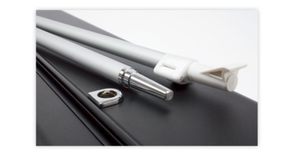
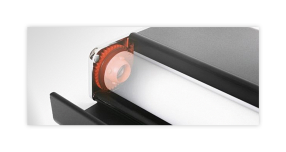
The most popular design feature of the Expand M2 is the Unique Modular Tension System. The graphic has tension when it is fully raised; however, when the banner is retracted in the display, there is no tension on the graphic. This clever system enables the cartridge to be easily removed and replaced.
Imagine having multiple pre-printed graphics that vary in content as well as design. Then take your imagination a little further and envision being able to interchange those graphics in just a couple of minutes with absolutely no tools or heavy lifting. Have it in your mind yet? YES! You are thinking of the M2 and its ultimate function!
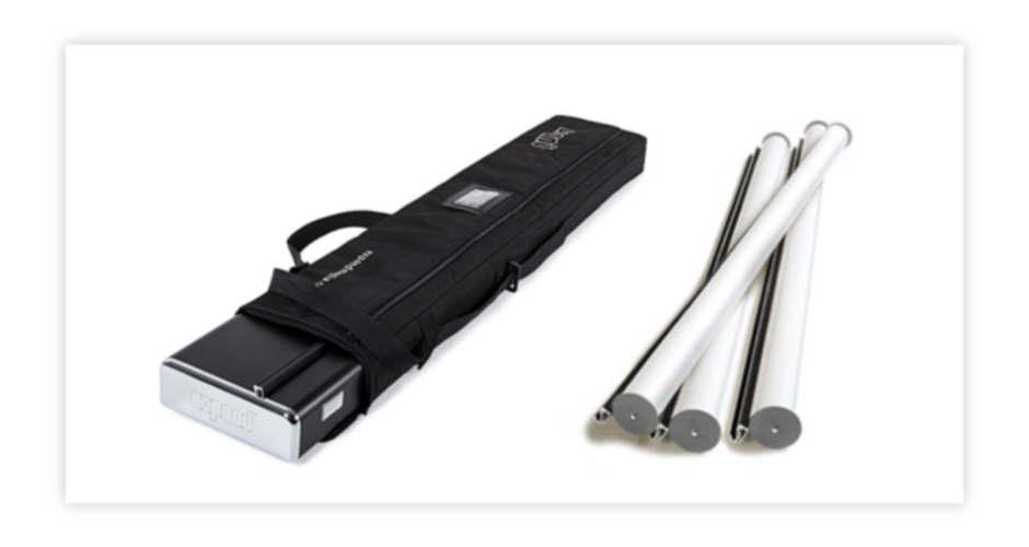
Traditional retractable banner stands cannot have their graphics changed without being sent off to a vendor for replacement. The M2’s ability to have graphics interchanged quickly, easily, and by your own hand is the main reason why this is FineLine’s go-to retractable banner.
An example of the M2s convenience can easily be seen in a tradeshow environment. A company’s booth is limited to the amount of space allotted to them, thereby limiting the space for content. With our help, our clients have found that using these M2 banners has made their shows go smoother because they have less to carry around and store. With one M2 you can have multiple cartridges with different messaging and rotate them during the tradeshow. This same idea can work for breakout sessions and multiple topics. It can even work with internal marketing within a company to promote different events!
Specs:
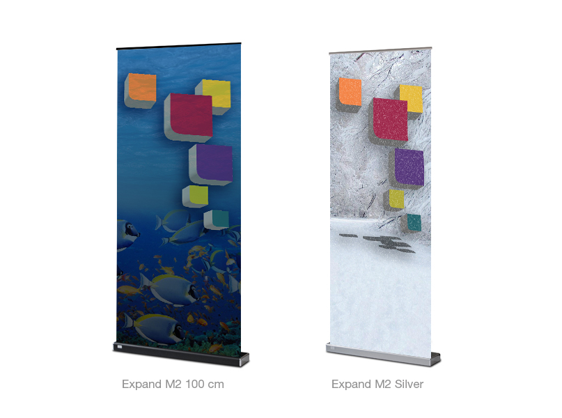
- The M2 is 85 cm (33.5 inches) wide and features an adjustable height that ranges from 160-225 cm (63-88.5 inches)
- Your graphics can be printed on vinyl, non-curl vinyl, or outdoor fabric
- The M2 is available in Black or Silver with chrome trim and will make your graphics looks stunning no matter what the environment.
Learn how FineLine can help your next show or event be a huge success!
Visit us at www.finelinegd.com or call 408-261-7676
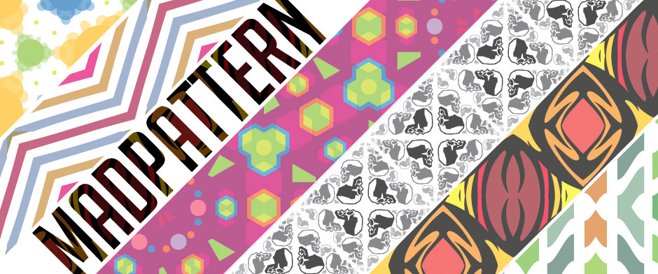
MadPattern
A few weeks ago I was searching for a way to easily generate patterns in Illustrator. There are many free resources available to download pattern swatches, and Illustrator does offer pretty awesome tools to create your own patterns as well. However, I did not want a pattern made by someone else. And even though Illustrator is amazing, I wanted to be able to generate a pattern in little to no time.
With my quest parameters set, I hopped on my computer and began my arduous search. I must confess that my search was relatively short, and not arduous in the least. Yes, I did have to visit a few websites and rummage about, but it was not long before I came across a site that had exactly what I was looking for.
The URL of this illustrious site is www.madpattern.com. As it turns out MadPattern is a collection of Adobe Illustrator templates that allows you to rapidly prototype patterns. Aside from the instantaneous gratification, MadPattern templates are all free to download.
MadPattern features include:
- One template for each type of pattern
- Automatic symmetric replication
- Automatic clipping of elements drawn “out of bounds”
- Easy to save/export repeating tile (for webpage backgrounds)
The ease with which you can create patterns is mind blowing. You might say… “it will drive you mad!” I would recommend watching the tutorials before you get your feet wet, but after that dive in and create.
Here are few of my own creations.
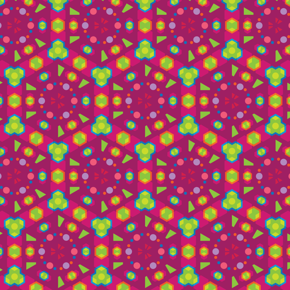


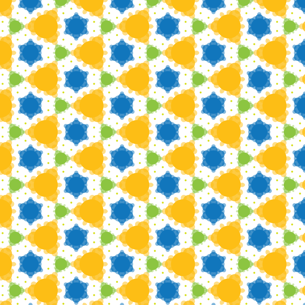
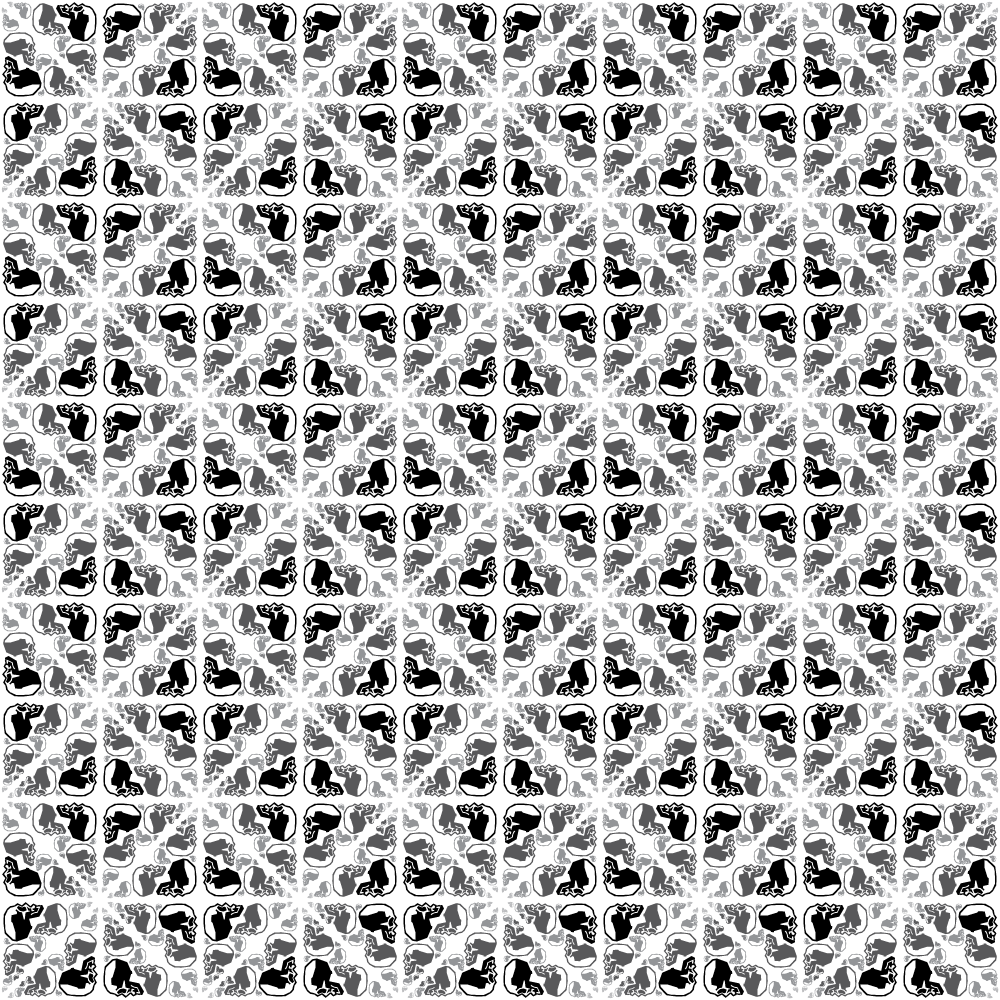

If you are on the hunt for easily generated, customizable patterns for Illustrator then give MadPattern a try. And if you do decided to MadPattern it up, post your patterns on Twitter and hashtag them, #FineLineGD.
Infographics

About two weeks ago I set out to determine what makes a good infographic versus a bad infographic. After reading numerous articles and blog posts on the subject, I gained an overall view of what other individuals thought.
Of course, I already had a view of my own. The prevalence of infographics has certainly grown over the years. I remember when a web search yielded only a few examples – along with simple bar, pie, and growth charts. Now a web search yields a ridiculous amount of examples of all different makes and models.
There are even infographics of infographics, which seems a bit over the top.
I do find infographics useful and visually stimulating. As a designer, taking information and turning it into a visual representation of data, information or knowledge is right up my alley. However, many of the infographics I have come across tend to make my eyes hurt from the amount of data crammed on to a page. In other instances, the infographics are full of random, meaningless facts in no apparent logical order.
As I waded through articles and blog posts alike, one theme in particular kept popping up in one form or another. The summation of the theme was this:
Successful infographics should contain great, interesting, and useful content that sets out to comprehend or solve a problem for time-poor audiences.
My interpretation of this theme is that the infographic must present data in a visual way that is easy to comprehend at a glance. However, as I stated before, most don’t! They are generally complicated. Nine times out of ten, I must carefully read the text accompanying the visuals to ascertain what the infographic is really about. Having to routinely do this leads me to conclude that infographics do anything but save time.
I don’t have an issue with sitting in front of an infographic and discovering the overarching message and the relationship of the presented data. I have always viewed infographics as conversation pieces in which people can debate, counter, or agree on the content.
Two names that seem to be synonymous with infographics or data visualization are Stephen Few and David McCandless. Before I began researching these two individuals I prematurely assumed that they would have similar views and somewhat like minds. All I can say is that I could not have been more wrong. The differences between these two are like oil and water. They just don’t mix.
David McCandless
David McCandless, author of “Information is Beautiful,” is a London-based author, data-journalist and information designer. He is considered the current trendsetter for visually striking infographics. He has been hailed by many as being on the cutting edge of visualizing ideas, issues, knowledge, and data. His mission statement from his blog www.informationisbeautiful.net states:
“Myself, and the rest of the crack team here at Information is Beautiful, are dedicated to distilling the world’s data, information and knowledge into beautiful, interesting and, above all, useful visualizations, infographics and diagrams.”
Here are some samples of David’s work.
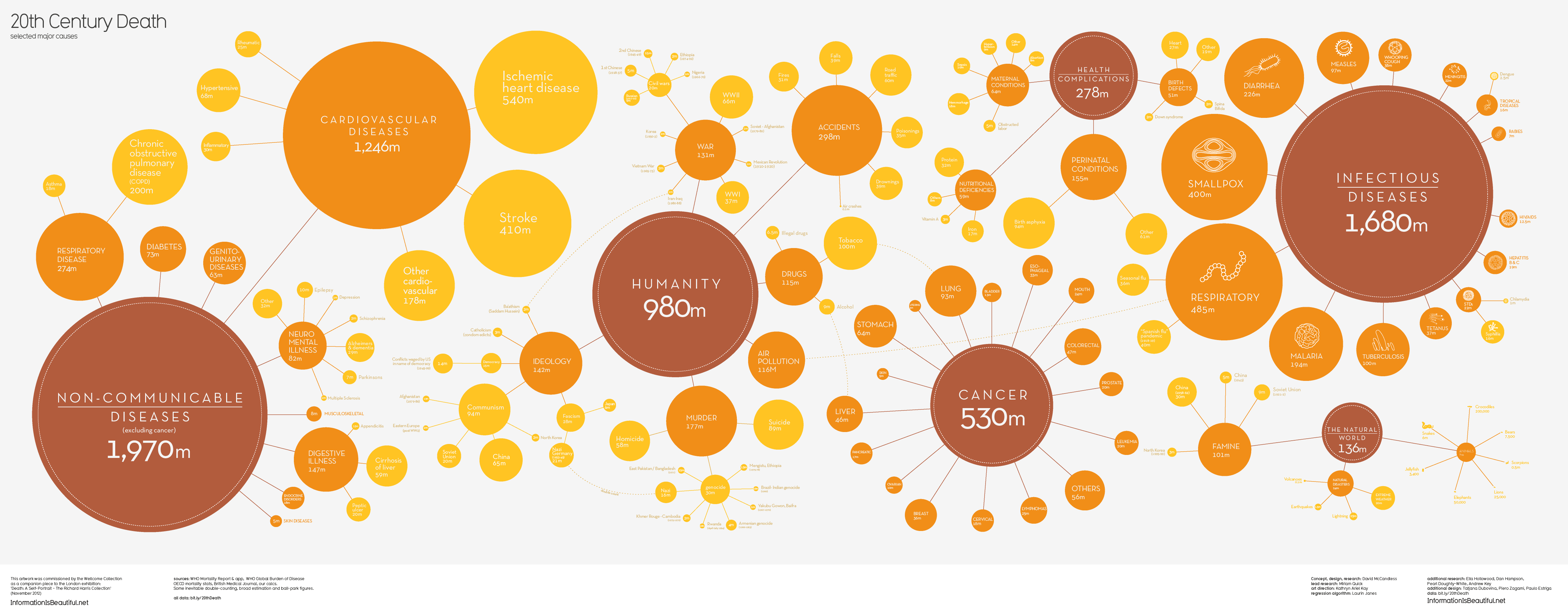
“20th Century Death: selected major causes,” by David McCandless. 2013. – Source: Information is Beautiful. 21 May 2014.
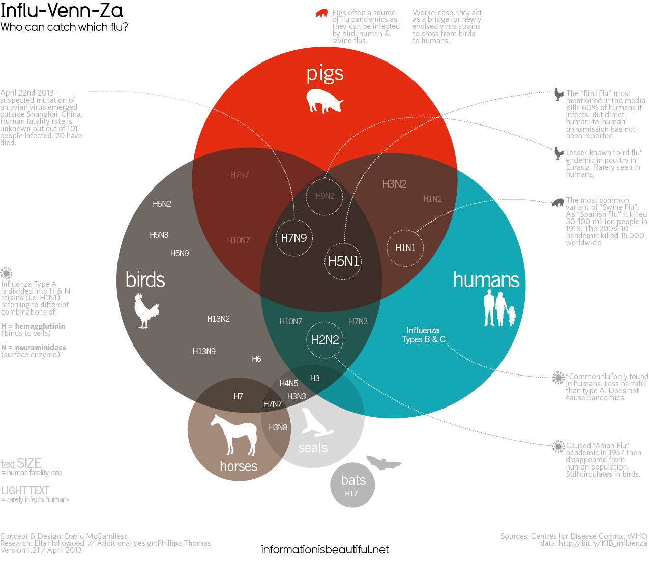
“Influ-Venn-Za: Who can catch which flue?” by David McCandless. 2013. – Source: Information is Beautiful. 21 May 2014.
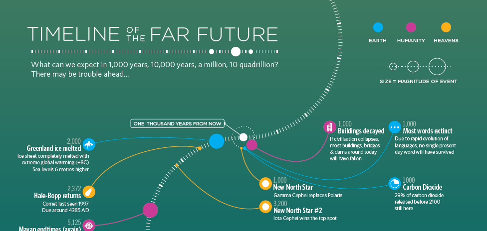
“Timeline of the Far Future,” by iibstudio. 2014. – Source: BBC Future. 21 May 2014.
There is no denying it, the inforgraphics created by David and his team are definitely beautiful and interesting. Hands down, my eyes definitely navigate to the bright colors and organic shapes found in all of his infographics. However, they look more like abstract art that draws you in, but in the end leaves you confused about what you are looking at.
Stephen Few
On the other side of the tracks we have Stephen Few. He is a 25 year IT innovator, consultant, and educator who has his own consultancy, Perceptual Edge. He tackles data visualization for analyzing and communicating quantitative business information. He provides consulting and training services, writes a monthly data visualization newsletter, speaks frequently at conferences, and teaches in the MBA program at the University of California at Berkeley.
Stephen Few’s approach to data visualization is more spartan when it comes to added graphical items. He focuses all of his attention on the data and how to make it the most accessible and understandable to the viewer. Stephen’s reasoning for how he approaches a data visualization problem stems from how humans perceive information.
In chapter 35 of Stephen’s book “Data Visualization for Human Perception” he states:
“Data visualization is only successful to the degree that it encodes information in a manner that our eyes can discern and our brains can understand. Getting this right is much more a science than an art, which we can only achieve by studying human perception. The goal is to translate abstract information into visual representations that can be easily, efficiently, accurately, and meaningfully decoded.”*
Here are some samples of Stephen’s work.
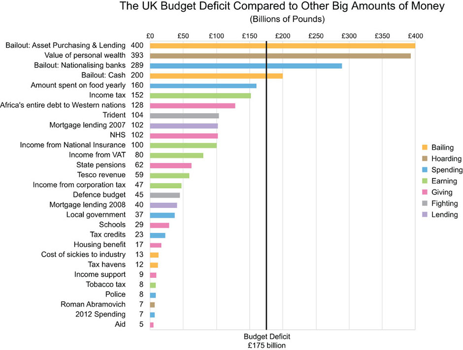
“The UK Budget Deficit Compared to Other Big Amounts of Money,” by Stephen Few. 2004-2014. – Source: Perceptual Edge. 21 May 2014.
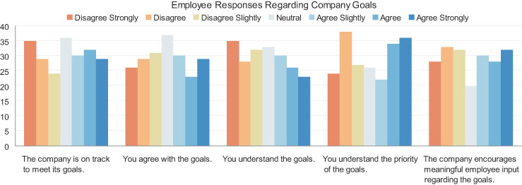
“Employee Responses Regarding Company Goals,” by Stephen Few. 2004-2014. – Source: Perceptual Edge. 21 May 2014.
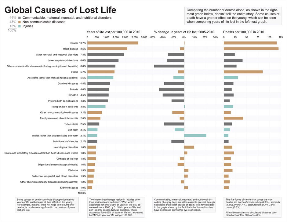
“Global Causes of Lost Life,” by Stephen Few. 2004-2014. – Source: Perceptual Edge. 21 May 2014.
There are other prominent infographic/data visualization designers in the world, but I wanted to focus on David McCandles and Stephen Few because they are on opposite sides of the spectrum.
Stephen Few has literally written volumes on the subject of data visualization and the more I read the more I am convinced his line of thinking is the way to go. As a designer, though, I find his charts and diagrams lack that hook to draw people in or to catch their eye, which David McCandless has achieved in his work. In an ideal world we could perfectly marry Stephen’s scientific/analytical approach and David’s graphical approach to data visualization. Then we would have the best of both worlds.
So what makes a good infographic?
Is it David McCandless’ view of “distilling the world’s data, information and knowledge into beautiful, interesting and, above all, useful visualizations, infographics and diagrams.”
Or
Is it Stephen Few’s view, “translate abstract information into visual representations that can be easily, efficiently, accurately, and meaningfully decoded.”
Perhaps it is a little of both.
A successful infographic contains useful information that can be translated into visual representations. These representations must tell the story, revealing and highlighting connections. The viewer should be able to easily, efficiently, accurately, and meaningfully decode the information.
* Few, Stephen (2013): Data Visualization for Human Perception. In: Soegaard, Mads and Dam, Rikke Friis (eds.). “The Encyclopedia of Human-Computer Interaction, 2nd Ed.”. Aarhus, Denmark: The Interaction Design Foundation. Available online at http://www.interaction-design.org/encyclopedia/data_visualization_for_human_perception.html

Recent Comments