Monthly Archives :
May 2014
Infographics

About two weeks ago I set out to determine what makes a good infographic versus a bad infographic. After reading numerous articles and blog posts on the subject, I gained an overall view of what other individuals thought.
Of course, I already had a view of my own. The prevalence of infographics has certainly grown over the years. I remember when a web search yielded only a few examples – along with simple bar, pie, and growth charts. Now a web search yields a ridiculous amount of examples of all different makes and models.
There are even infographics of infographics, which seems a bit over the top.
I do find infographics useful and visually stimulating. As a designer, taking information and turning it into a visual representation of data, information or knowledge is right up my alley. However, many of the infographics I have come across tend to make my eyes hurt from the amount of data crammed on to a page. In other instances, the infographics are full of random, meaningless facts in no apparent logical order.
As I waded through articles and blog posts alike, one theme in particular kept popping up in one form or another. The summation of the theme was this:
Successful infographics should contain great, interesting, and useful content that sets out to comprehend or solve a problem for time-poor audiences.
My interpretation of this theme is that the infographic must present data in a visual way that is easy to comprehend at a glance. However, as I stated before, most don’t! They are generally complicated. Nine times out of ten, I must carefully read the text accompanying the visuals to ascertain what the infographic is really about. Having to routinely do this leads me to conclude that infographics do anything but save time.
I don’t have an issue with sitting in front of an infographic and discovering the overarching message and the relationship of the presented data. I have always viewed infographics as conversation pieces in which people can debate, counter, or agree on the content.
Two names that seem to be synonymous with infographics or data visualization are Stephen Few and David McCandless. Before I began researching these two individuals I prematurely assumed that they would have similar views and somewhat like minds. All I can say is that I could not have been more wrong. The differences between these two are like oil and water. They just don’t mix.
David McCandless
David McCandless, author of “Information is Beautiful,” is a London-based author, data-journalist and information designer. He is considered the current trendsetter for visually striking infographics. He has been hailed by many as being on the cutting edge of visualizing ideas, issues, knowledge, and data. His mission statement from his blog www.informationisbeautiful.net states:
“Myself, and the rest of the crack team here at Information is Beautiful, are dedicated to distilling the world’s data, information and knowledge into beautiful, interesting and, above all, useful visualizations, infographics and diagrams.”
Here are some samples of David’s work.
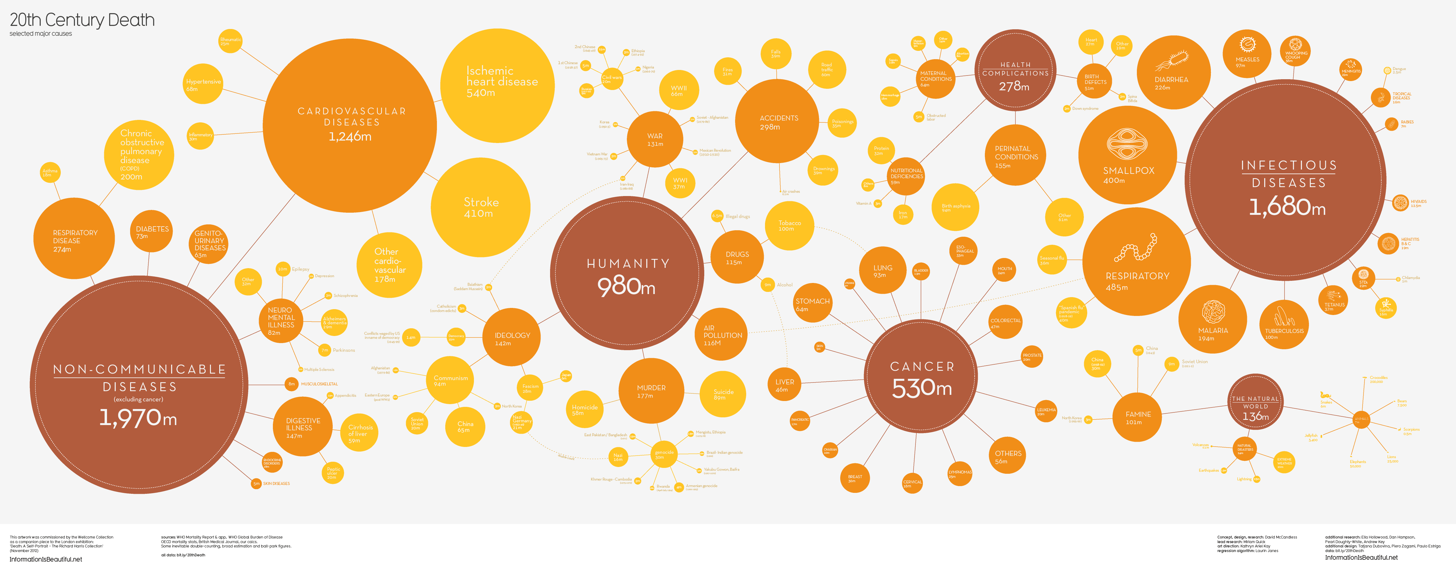
“20th Century Death: selected major causes,” by David McCandless. 2013. – Source: Information is Beautiful. 21 May 2014.
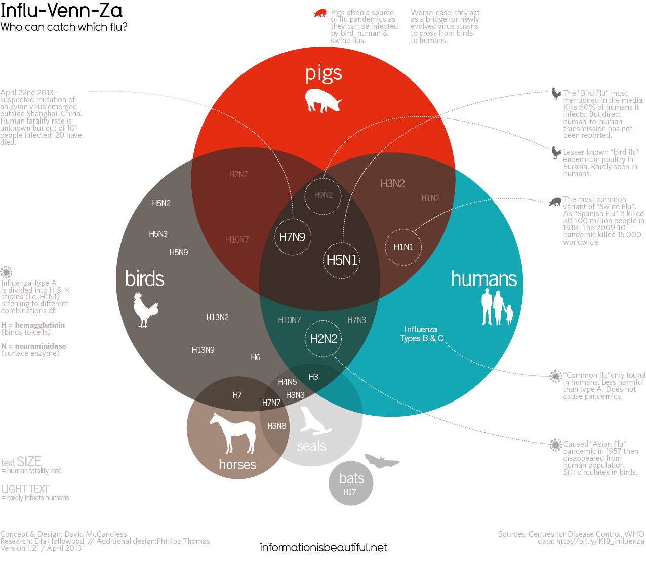
“Influ-Venn-Za: Who can catch which flue?” by David McCandless. 2013. – Source: Information is Beautiful. 21 May 2014.
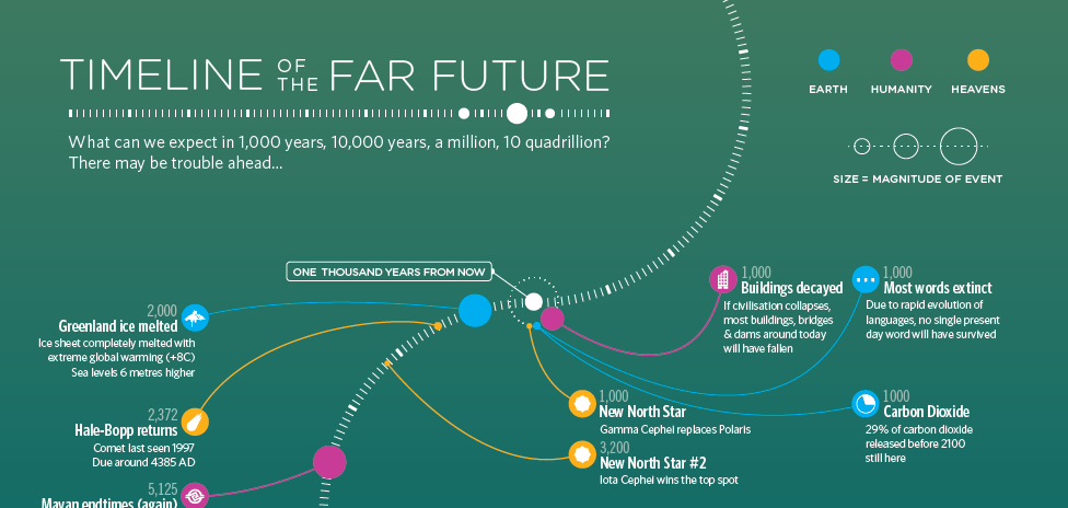
“Timeline of the Far Future,” by iibstudio. 2014. – Source: BBC Future. 21 May 2014.
There is no denying it, the inforgraphics created by David and his team are definitely beautiful and interesting. Hands down, my eyes definitely navigate to the bright colors and organic shapes found in all of his infographics. However, they look more like abstract art that draws you in, but in the end leaves you confused about what you are looking at.
Stephen Few
On the other side of the tracks we have Stephen Few. He is a 25 year IT innovator, consultant, and educator who has his own consultancy, Perceptual Edge. He tackles data visualization for analyzing and communicating quantitative business information. He provides consulting and training services, writes a monthly data visualization newsletter, speaks frequently at conferences, and teaches in the MBA program at the University of California at Berkeley.
Stephen Few’s approach to data visualization is more spartan when it comes to added graphical items. He focuses all of his attention on the data and how to make it the most accessible and understandable to the viewer. Stephen’s reasoning for how he approaches a data visualization problem stems from how humans perceive information.
In chapter 35 of Stephen’s book “Data Visualization for Human Perception” he states:
“Data visualization is only successful to the degree that it encodes information in a manner that our eyes can discern and our brains can understand. Getting this right is much more a science than an art, which we can only achieve by studying human perception. The goal is to translate abstract information into visual representations that can be easily, efficiently, accurately, and meaningfully decoded.”*
Here are some samples of Stephen’s work.
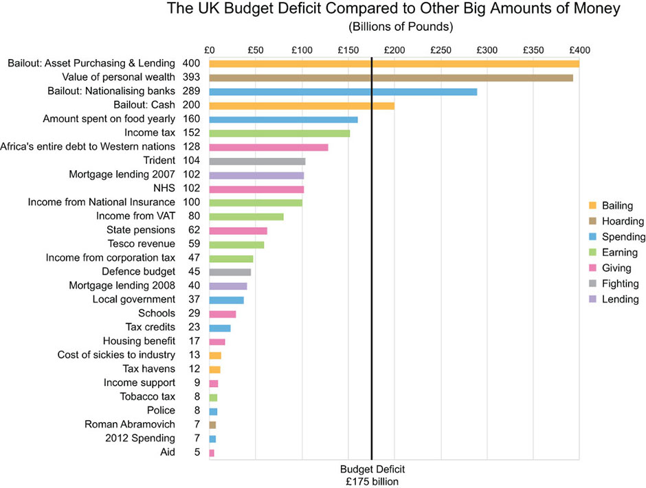
“The UK Budget Deficit Compared to Other Big Amounts of Money,” by Stephen Few. 2004-2014. – Source: Perceptual Edge. 21 May 2014.
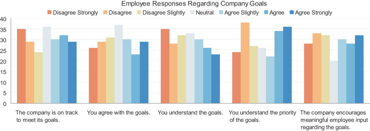
“Employee Responses Regarding Company Goals,” by Stephen Few. 2004-2014. – Source: Perceptual Edge. 21 May 2014.
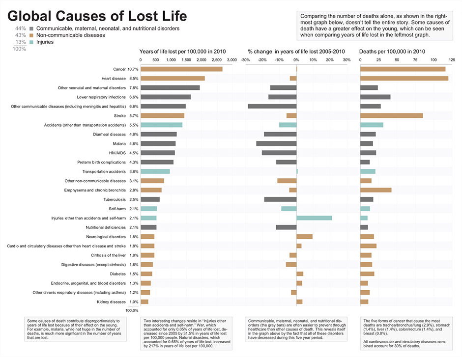
“Global Causes of Lost Life,” by Stephen Few. 2004-2014. – Source: Perceptual Edge. 21 May 2014.
There are other prominent infographic/data visualization designers in the world, but I wanted to focus on David McCandles and Stephen Few because they are on opposite sides of the spectrum.
Stephen Few has literally written volumes on the subject of data visualization and the more I read the more I am convinced his line of thinking is the way to go. As a designer, though, I find his charts and diagrams lack that hook to draw people in or to catch their eye, which David McCandless has achieved in his work. In an ideal world we could perfectly marry Stephen’s scientific/analytical approach and David’s graphical approach to data visualization. Then we would have the best of both worlds.
So what makes a good infographic?
Is it David McCandless’ view of “distilling the world’s data, information and knowledge into beautiful, interesting and, above all, useful visualizations, infographics and diagrams.”
Or
Is it Stephen Few’s view, “translate abstract information into visual representations that can be easily, efficiently, accurately, and meaningfully decoded.”
Perhaps it is a little of both.
A successful infographic contains useful information that can be translated into visual representations. These representations must tell the story, revealing and highlighting connections. The viewer should be able to easily, efficiently, accurately, and meaningfully decode the information.
* Few, Stephen (2013): Data Visualization for Human Perception. In: Soegaard, Mads and Dam, Rikke Friis (eds.). “The Encyclopedia of Human-Computer Interaction, 2nd Ed.”. Aarhus, Denmark: The Interaction Design Foundation. Available online at http://www.interaction-design.org/encyclopedia/data_visualization_for_human_perception.html
The Granola Bar Mystery
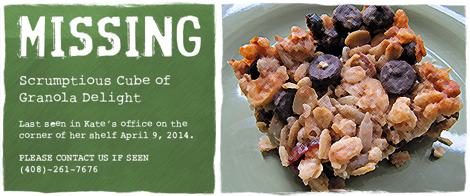
Not too long ago we had an incident within the fair walls of FineLine Graphics & Design. To be honest, it was nothing of import, but it did cause a bit of a stir in the office. Kate Humphrey, one of our Senior Project Managers, had a granola bar taken from her office. It was not the usual granola bar in an airtight wrapper. No, this was a granola square that was homemade with love and care. One wild theory after another was drafted by each of us, but how the granola square disappeared was simply a mystery.
Like everyone else, I tried to shed some light on the situation and in doing so I wrote an email to all detailing the marvelous and terrible story of the granola square’s demise.
Hello All,
It has come to my attention that there is a family of Borrowers living within the walls of our fair building. The family consists of a mother (Marta), father (Paul), son (Jimmy) and daughter (Greta). I do believe they have a pet of some kind and I am inclined to say it is a lime green caterpillar. Due to the caterpillar’s plump size the family decided to name him Lump.
Over the past few years of working at FineLine I have been able to approach and befriend this family of Borrowers. We came up with a very small treaty, which was signed by all with very small signatures. The treaty stated that we, the FineLine residents, will dutifully try not to stamp, squash, or sit on any Borrower located with the FineLine walls. In addition, we would also alert the Borrowers to any appointments set with exterminators so they might adjourn to the trees surrounding the building while the bugs or pests were eradicated. In turn, the Borrowers agreed not to steal any property of ours. They may borrow things from time-to-time, but they would return whatever it was in a timely fashion.
Now to the heart of the matter. On April 9, 2014 at approximately 2:54 pm a delicious granola square was stolen, pilfered, pinched, filched from the corner of Kate’s shelf. She noticed it was missing the next morning, April 10, 2014, as she sat down at her desk, preparing to enjoy her morning coffee and anticipating the enjoyment with which she would savor the sweet taste of the granola square she had saved. Imagine her disdain as she found her coveted breakfast snack had gone missing. She sent out an email lamenting the loss of such a scrumptious cube of granola delight, demanding to know who the vile thief was. To her dismay and bewilderment, all FineLine employees, myself included, vehemently denied the accusation that we had gobbled up the tasty morsel.
To be honest, this stymied me as well. So immediately I took it upon myself to investigate this horrible crime of passion and hunger. I searched the office high and low and then set about searching it low and high. I used a magnifying glass, binoculars, telescope, electron microscope, and then lastly I looked through an empty glass coke bottle at every minute detail. However, my efforts were to no avail. My degree in Gumshoery, that I received in the fourth grade, had not aided me at all.
Just when I was about to give up my search and put this particular case into cold storage, my eye alighted on a series of caterpillar tracks, barely visible, on the wall right outside of Kate’s office. Using a mixture of plaster and water I made liquid plaster, which I poured into each caterpillar track. Once the plaster was dried I removed each mold. Using the molds I recreated a 3D rendering of the caterpillar’s feet.
As I was viewing the 3D rendering, a light went off above my head as Pam turned on the light in my office. Then I had an amazing breakthrough. The Borrowers had a lime green caterpillar named Lump. And he was predisposed to indulging too often in delectable foods. Without hesitation, I banged on the walls until Paul, the father of the Borrower family, emerged. I presented him with my findings and told him about the conclusions I had drawn based on the efforts of my intellect. In the end he confessed, that his lime green caterpillar, Lump, had shamefully eaten the granola square.
There you have it everyone. The culprit is none other than Lump. No charges have been brought up against the plump lime green guy. The embarrassment could be plainly seen on his tiny little face. He looked so sad and pathetic that I decided his thievery should not come to light. Instead, with the aid of Freddie (one of my conspiratorial co-workers), we spun a riveting story about how Dillon, a young golden retriever whose family (Steve & Patty) works here, had bound into Kate’s office and vacuumed up the granola square.
To both our delight, the story was received well by everyone and Lump lived on to become a beautiful butterfly that was later eaten by a bird.
Regards,
Lars Shaw
I admit there may be some holes in my theory, but I stand by it. At the very least, I concocted a captivating story that may provide a laugh or a guffaw for the reader.
If there is something to take away, it is that we at FineLine are a group of creative individuals. And our creativity extends far beyond design!
Oscar Reutersvärd, the Father of “Impossible Figures”
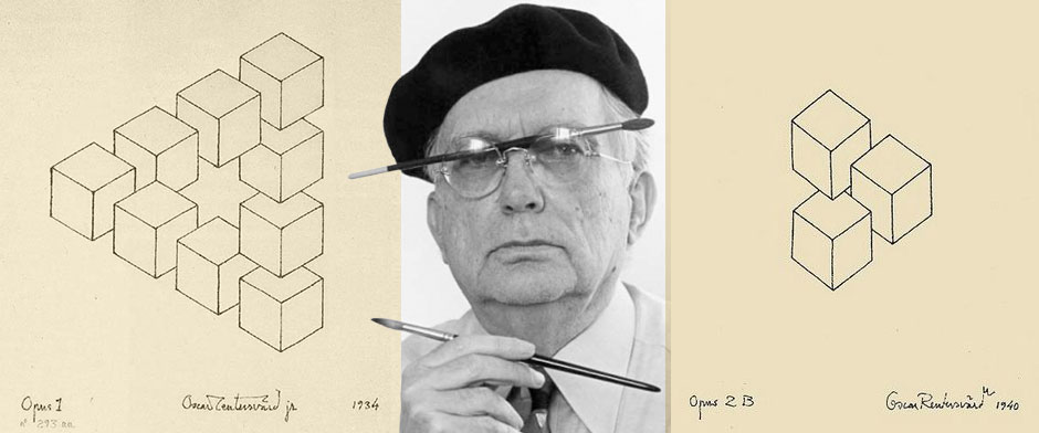
Left: Sketch by Oscar Reutersvärd, Opus 1 (1934) – Source: Impossible World. 1 May 2014.
Middle: Poster for the Hommange a Oscar Reutersvärd, by the Galerie Bell’Art, Stockholm (2001) – Source: Galerie Bell’Art, Stockholm. 1 May 2014.
Right: Sketch by Oscar Reutersvärd, Opus 2B (1934) – Source: Impossible World. 1 May 2014.
For as long as I can remember, “impossible figures” have been one of my passions. I was first introduced to the world of the impossible figure by works of M.C. Escher. Due to his widespread prominence, other impossible artists have, unfortunately, been eclipsed by his immense shadow.
While searching for more obscure artists, I was pleased to discover Oscar Reutersvärd – a Swedish artist who became widely known as the “father of impossible figures.” He pioneered the art of 3D drawings which may initially appear feasible, yet cannot be physically constructed. His first impossible figure was the “impossible triangle,” which he created out of a series of cubes in 1934. The triangle at first seems like a simple geometrical shape. However, as the eye tries to follow its outlines, the triangle abruptly becomes a dizzying experience – as its bottom link plays havoc with the brain’s intuitive knowledge of physical laws. Since that initial creation he went on to develop more than 2,500 impossible figures.
It was with great surprise and satisfaction that I stumbled upon Oscar’s “Window in the Floor” series. An attempt to describe this series will seriously not do it justice. A picture is worth a thousand words – so, below are some of Oscar’s drawings from the series.
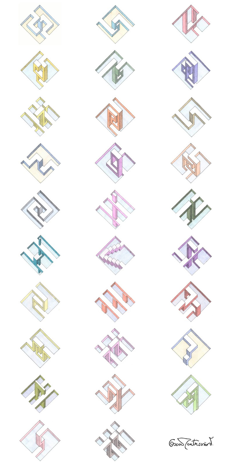
Gallery of “Window on the Floor” series, by Oscar Reutersvärd. 2001-2013. – Source: Impossible World. 1 May 2014.
These drawings are just amazing to me. They are so amazing, in fact, that they have rekindled my own interest in drawing impossible figures. I find it fascinating that a series of simple lines drawn on a piece of paper can yield such amazing results.
Here are a few sketches of my own inspired by Oscar’s “Window in the Floor” series.

If you wish to see more of Oscar Reutervärd’s work, visit Impossible World. In addition to Oscar’s work there are works of other impossible artists to be enjoyed.

Recent Comments